Introduction:
In the second phase
of our project, my group and I digitally mapped the terrain that was created
last week and made needed corrections. While interpolating the terrain in
ArcMap and analyzing our results in ArcScene, my group and I learned quite a
bit about what we had done well and what needed the most improvement. We
concluded that our data was not sufficient enough to create a digital model in
the detail we desired; therefore, we would have to completely recollect our
data using a smaller grid size. We also decided to make slight alterations to
our measuring methods in the field to be more efficient and accurate. Our second
round of the data collection and analysis went much more to our liking, and the
results are far more detailed and pleasing than what we had seen with the
first.
Methods:
Part I: Evaluating the previously collected data
In order to model our terrain, we first had to import our
Excel file containing all the data points we collected, which included their
respective X, Y, and Z values, into ArcMap. We used a simple Add X, Y Values
tool to map the points and converted them to a point feature class to use for
interpolation. From this point, we used various interpolation tools from the 3D
Analyst toolbox to view our data. These tools included IDW, Nearest
Neighbor, Kriging , Spline, and a TIN which will be explained in Part II of this section. We were to choose the interpolation that best
represented our real-life model accurately while remaining
aesthetically pleasing. To better view the results, we imported each
interpolation into ArcScene so as to make a 3D model. Unfortunately, after
seeing our results (Figure 4 is an example of the IDW interpolation in Part II of Methods), our group concluded that our data was not up to our standards,
and it would be impossible to create any model that we found acceptable with our data.
Part II: Collecting data and evaluating results
After evaluating our previously collected data, my group and I came to the realization that our data was insufficient and changes were needed. The greatest issue we came across was that there simply were not enough data points to create an accurate depiction of the terrain. Our 3D mappings came out choppy, and certain features, like the river, were indistinguishable. Re-collecting data in a smaller grid size seemed to be the only viable solution to the problem.
We decided that a 5cmx5cm grid size would be the best option because it would give us twice as many data points, and it is an easy number to go by (and quite frankly anything smaller would have taken far too much time in the cold and resulted in several frostbitten toes). Luckily for us, the weather was in the 30 degree Fahrenheit range this time around--a good 40 degrees warmer than last week. Another adjustment we made was the measuring system we were using. In the previous week, we set up meter sticks along the side of the planter box and estimated where our data points would be, moving the meter sticks up as we moved along. This week, we used string (which is very difficult to find for whatever reason--we had to settle for clothesline and borrowed string from another group) and thumb tacks to set up our X-axis. We had 22 strings altogether crossing over our terrain (Figure 1).We then made marks along the Y-axis every 5cm. When we moved up along the Y-axis, we would use the measuring stick to create a straight path from one marking to the marking on the opposite side of the box and measured either up and down from the intersection of the string and meter stick for our Z-values.
Figure 1

This is the final product of our string measuring system (X-axis) for our new terrain model
Because there was a week's difference in time between the first collection of data and the second, we had to slightly rebuild our terrain. Fortunately, the major features were partially preserved and the two terrains are almost exactly the same. There was quite a bit more snow to work with this week as compared to last week, so all of our features for the second week are at slightly higher elevations. To make up for this, we used -8 cm from the top of the sandbox as our arbitrary sea level rather than -13, so the elevation levels in our models should be the same.
After rebuilding and collecting the data, which took about 2 hours to complete, we followed the same process as with the previous data to make a 3D model. We created and uploaded our Excel file into ArcMap and made a point feature class, but this time, we had data that was twice as dense (Figure 2 and Figure 3).
Figure 2 Figure 3


These are the two point feature classes created in ArcMap from the data points collected in the field. Figure 2 represents the data points from our first time measuring in the field with a 10cm by 10cm grid, while Figure 3 represents the second attempt with a 5cm by 5cm grid.
With the same 5 interpolation methods used with the previous data (IDW, Kriging, Nearest Neighbor, Spline, and a TIN--shown and explained with Figures 5-9), we created various 3D representations of our terrain from which to choose our favorite. To do this, we uploaded our interpolations from ArcMap into ArcScene just as we had done with the data from last week. As expected, all of the new 3D models were much more accurate and encapsulated all of our major features in much finer detail than with the first models. (Figure 4 and Figure 5).
Figure 4
 As shown by Figure 4 and 5, the number of data points collected was a huge factor in creating a proper representation of our terrain. Although most of the major features can be seen in both figures, they appear completely different. It almost looks like two entirely different maps. The IDW was not the best interpolation of either of the maps, but the differences between the two grid sizes are clearly presented using this interpolation.
IDW interpolation of the first set of data we collected
using a 10cm by 10cm grid
Figure 5

IDW: The IDW (Inverse Distance Weighted) interpolation creates values for unknown points by taking a weighted mean of surrounding known points. Some known points contribute more to the mean than others depending on their proximity to the unknown point. IDW is best used with densely collected data points.
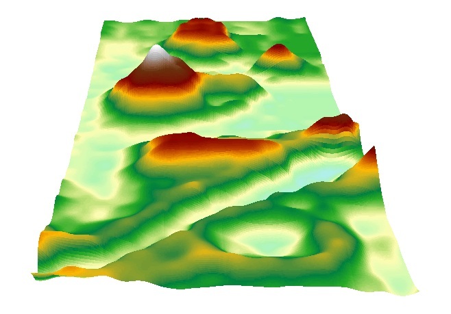
IDW interpolation of the second set of data
collected using a 5cm by 5cm grid
Figure 6

Kriging: This interpolation method uses a statistical relationship, known as spatial correlation, among known points to predict unknown points. It "assumes that distance or direction between sample points reflects a spatial correlation that can be used to explain variation in the surface" and uses a mathematical equation to find the unknown points (ArcGIS Help). It is fairly accurate in its predictions because it relies on these statistics.
3D model of our terrain using the Kriging method using a 5cm by cm grid
Figure 7
 Natural Neighbor: In order to find the value of an unknown point, Natural Neighbor takes the values of the nearest known points and creates a weighted average based on proportionate values. Because it only uses the "neighboring" points, the new point will have a value that falls within the range of its neighbors and does not create any new features that aren't already shown with the known points.
The terrain mapped using the Natural Neighbor interpolation method and a 5cm by 5cm grid
Figure 8
Spline interpolation of our terrain using a 5cm by 5cm
grid
Figure 9

TIN: A TIN (Triangulated Irregular Network) takes the data points and connects them using a series of edges to create triangulated surfaces that are all interconnected. TINs are generally used with data points that are in an irregular pattern--unlike the data we collected for this project.
TIN representation of our data using a 5cm by 5cm grid
After viewing the newer, 5cm by 5cm interpolations in ArcScene, we concluded that Kriging was the best representation because it most accurately modeled our real-life terrain. After reading about the different interpolation methods, Kriging seemed to be the most suitable because it uses a statistical method to calculate unknown points and tends to be exact. As far as the aesthetics go, Kriging is among the best interpolations, though it is a bit difficult to see the differences between Kriging, Natural Neighbors, and Spline.
Discussion:
Having completed the assignment, it is incredible to see the progression from last week's results to the results of this week. By simply comparing the 3D models with a 10cm by 10cm grid and those with a 5cm by 5cm grid (Figures 4 and 5), it is overly obvious that there was great improvement. My group and I were able to asses our first models, determine the major issues, and resolve them by remapping with a smaller grid size, and ensuring accuracy by employing new measuring techniques.
Despite the fact that the 3D models this week are far superior to the previous models, there are still some uncertainties with the data. Because we had to rebuild our terrain this week, the features are not exactly the same as they were before. Therefore, it is unfair to compare the models from this week and last week as the data isn't the same. Also, our measuring technique was far more accurate than last week's, but it still was likely to be imperfect as we were rounding to the nearest half centimeter.
Conclusion:
Through this project, my group and I were able to use critical thinking and improvisation to solve the issues we had with our data and vastly improve our results. We were able to use several interpolation techniques to view our data and chose the Kriging method as our preferred interpolation of our new data. I am very impressed with our final 3D model and feel as though I learned quite a bit about what it means to work in the field. It is very important to be able to work through various obstacles like lack of materials or weather conditions, and also to go back and make improvements to the data.
I apologize for formatting errors--I tried to fix them up as much as possible, but for some reason there were a lot of issues with the images and surrounding text.
ReplyDelete