Pages

Saturday, May 11, 2013

ArcPad Data Collection


Introduction:

For this week’s activity, my class and I went about setting up a data collection procedure by creating a geodatabase with feature classes and deploying them to a Trimble Juno GPS unit to collect data at the Priory in Eau Claire (Figure 1). The main purpose of this activity was to create a database for the Priory with information on the area for recreational purposes and to help restore it in the future. We were able to work in groups and choose one or two features that we wished to map. Then we had to plan the fields and domains that would accompany the features we would include for our portion of the map. There were several options to select from including trails, view points, erosion points, trees—dead or notable—or various man-made objects. My group and I decided to focus on the man-made objects by mapping any signs or garbage that we found in the Priory.


Figure 1: This is the Trimble Juno unit we used to collect data in the field.
Study Area:

The area we have been working in is known as the Priory and is owned by the University of Wisconsin-Eau Claire. It is located on the south side of the city of Eau Claire in Wisconsin in a more rural setting. The Priory is a hilly area with several steep ridges and gorges and is mostly wooded. There are some open areas near the Priory building, a house, and a waste pond located on the site, however (Figure 2).


Figure 2: This is an aerial image of the Priory in Eau Claire, Wisconsin. The outline defines our navigation boundary. As can be seen, most of the area is covered in trees.

Methods:

Once we had chosen the two features that we wished to map, my group and I had to come up with the fields and domains that each feature would include. For the garbage, we decided to create three attributes—material, size, and type of garbage. Then, we came up with several options for each attribute and made domains from these. The domain type that was appropriate for this situation was a coded value domain. The coded value domain allows the user to specify specific options for the attribute that will later be selected from a drop down menu. Once the values are set in the domain, the user cannot choose any other value. For example, for the garbage material attribute, we created four values that could be potential material types—plastic, paper, aluminum/metal, and other. Then we set up the coded value domain to text and entered in these options. Later, in the field, we could only select one of those four material types.  The advantage of setting up the domain in this way is that there is less user error through misspelling and it is faster/easier to enter in the values while in the field. The rest of the attributes and domains for the garbage and signs can be seen in the following table. Every domain was set to be a coded value text domain. All of this work can be done within ArcCatalog and ArcMap and should be saved to a geodatabase.
Figure 3: This is a table that includes the features and their attributes and domains. We used these to collect the features in the field and describe them by their attributes.


After the data had been set up in Arc, we had to deploy our features to a Trimble Juno GPS unit. Before doing so, however, we had to change the symbology of our features so that they could be easily recognized in the field. We also had to ensure that the fields and domains were set correctly. We used the ArcPad Data Manager Extension and toolbar to do this. Basically, we converted the map we created in ArcMap (.mxd file) to an ArcPad map (.apm file). ArcPad is simply software designed for mapping purposes on a mobile device. From that point, we just copied and pasted the .apm file into the SD card of the Juno GPS unit which we could pull up on the unit in ArcPad.

With the geodatabase and  data deployed to our units, we were ready to collect the data in the field. This was a relatively intuitive process. We brought up our maps on our respective GPS units and then selected the appropriate feature we were mapping as we stood near it. Once selected, we had to fill in the fields we created earlier with the values generated within our domains. My group and I also decided to pick up the garbage we were mapping along the way to help clean up the Priory as well. After collecting the data, we uploaded our points back into ArcMap and were able to view the results.

Results/Discussion:

Although we were unable to collect data throughout the entire Priory, we found some patterns with our data. Most of the garbage we found was near the parking lot area and along the tree line going into the forest. Once we were in the forest, however, we found little to no garbage. As for the signs, we found two distinct areas/types for the most part. The first was a group of parking signs surrounding the parking lot. The second was a group of signs that delineated a trail through the woods. Other than these, there were few signs to be found.
Figure 4: This is a map displaying the locations of garbage and the garbage material. Most of the garbage we found was plastic.
 
 
 Figure 5: This map shows the garbage size. Most of the garbage we found were small items. We had one point that was actually a large group of garbage that we labled "other".


Figure 6: This map shows the garbage type by location. We found a wide variety of garbage around the area, so most of the garbage types are classified as "other".

Figure 7: This is a map displaying the locations of garbage for each group member. As can be seen, most of the garbage we found was near the side of the building in the center. This is likely due to the fact that there were two dumpsters near that spot, and the garbage flew out of the dumpster onto the ground.

Figure 8: This is a map of the signs we located represented by their color. Most of the signs were an orange color because they were trail markers along one of the trails in the Priory.

Figure 9: This is a map of sign material. A vast majority of the signs were made of metal, though we found one that was made of wood.
 
Figure 10: This is a map displaying the location of different types of signs. We had a pretty even split between navigational signs and informational signs. The navigation signs were trail markers and the informational were parking signs along the large parking lot near the building in the center.

Figure 11: This is a map of the signs collected by each group member. As can be seen, most of the signs followed a path along the northern part of the image and another large group surrounded the parking lot in the southwester part of the map.

This project, though seemingly simple, turned out to be a bit difficult for the class. My group and I had little trouble using the GPS units to collect our data, but other groups struggled with technical problems with their GPS units and setting up their domains. The only issue my group and I had was that we did not have the exact same fields for our data. One member decided to omit the “Shape” field for our signs while another did include it. We also forgot to include a notes field for the garbage feature, so we could not write any additional information on those points. In the grand scheme of things, this was a minor issue. We also were unable to walk throughout the entire Priory, so our data is limited to the southwestern section of the area.

Conclusion:

Overall, this project helped the class learn how to set up data for data collection from the ground up. We created our own geodatabases and came up with features with unique attributes and domains. This is an extremely valuable and powerful skill and will likely be used in the future. The project also helped us to understand more about domains, how they work, and why they are useful. Then, we used this data to collect the locations of signs and garbage out in the Priory. My group and I were fortunate enough to run into very few issues with our data, though we were unable to completely survey the area we were working in.

High Altitude Balloon Launch (HABL)


Introduction:

As our last balloon launch, my class and I sent an eight foot diameter balloon along with a camera and rig up into the stratosphere to collect images. We have been leading up to this launch for quite some time as we developed the rigs months ago and have been testing out the balloons for our aerial imagery projects. We weren’t sure what to expect in terms of distance or the imagery we collected, but were very happy with the results. The balloon reached a height of about 100,000 feet above the Earth’s surface and travelled nearly 80 miles over the course of about an hour. The balloon eventually popped due to pressure in the atmosphere and fell near Marshfield, Wisconsin. We were then able to find and gather the balloon and view our imagery. We were able to collect some really fantastic imagery of the Eau Claire area and western Wisconsin.

Figure 1: This is the path that the balloon flew after it was released from the UW-Eau Claire campus. (Map credit to Joe Hupy.)
Methods:

The rig for this launch was created back in February along with the rigs for the aerial imagery balloon launches. We used a Styrofoam bait warmer to hold the camera with heating packs inside to keep the camera from freezing at such great heights. We also cut a hole in the bottom of the bait warmer to fit the size of the camera lens so that it could collect imagery of the Earth. Four strings about three feet long were tied to the warmer and taped along the sides connecting at the top with a carabiner at the top to suspend the rig from the bottom of the balloon. A GPS unit was also attached so we could track the balloon and collect it once it landed. A parachute was attached so the rig could land safely after the balloon popped up in the atmosphere as well. The camera we selected for the HABL was a digital flip camera, and we took video rather than a continuous shot mode as we had for the aerial mapping launch.


Figure 2: This is a photo of the rig that we created for the high altitude balloon launch. It was developed earlier on in the semester.


On the day of the launch, we filled the balloon using a large helium tank. We had to be sure to fill the balloon with enough helium that it would rise quickly, but also leave enough space for the helium to expand with the higher altitude without popping the balloon right away. Once the balloon was filled properly, we attached the rig, making sure the camera was set to the correct settings. Then we were ready to launch the balloon. We chose to release the balloon at 10a.m. on the 26th of April because the weather conditions were most permissible at that time. The balloon was let go in the center of our campus mall.
 Figure 3: This is an image of the class walking the balloon to the center of campus for the launch after it had been filled.
At first, we weren’t receiving a signal from the GPS unit attached to the rig and weren’t sure if we would be able to recover the footage. Fortunately, after about an hour, the signal appeared near the city of Marshfield, Wisconsin—78 miles east of Eau Claire. Our professor and a couple students then set out to find the balloon and bring back the rig. They found that the balloon had landed on some private property and had to ask the land owner’s permission to retrieve the rig. They received permission and ended up having to climb up a 50 foot tree to get it down. Our professor had to saw off a limb of the tree to actually recover the rig.
 Figure 4: This is an image of our professor climbing  a 50 foot tall tree to retrieve the HABL rig. He ended up sawing off a large branch of the tree.

Results/Discussion:

The HABL was an overall success—we were able to recover some amazing images from the camera and have a video of most of the flight. There were several aspects of the rig and camera that did not go perfectly, however. Unfortunately, once the camera had reached a certain height, condensation began to cover the camera lens producing a hazy film for some of the imagery. The camera was only able to capture about an hour of footage before the battery died, as well. This wasn’t a huge issue as we were still able to see the launch up through the point where the balloon began its descent, but it would have been nice to see the entirety of the launch. We also decided that any future launches would also include a barometer, thermometer, and anemometer to collect more information about the flight.

Figure 5: This is a stillframe from the balloon as it left the UW-Eau Claire campus. This is one of the very first images that was collected during the flight.

Figure 6: This is an image of the Chippewa River to the east of Eau Claire. As can be seen, the balloon had reached much greater heights at this point than it had while it was near the campus.

Figure 7: This is one of the last images taken by the camera before the battery died at about 100,000 feet in the air.

Conclusion:

The high altitude balloon launch was an amazing experience for our class. Very few people have been lucky enough to send a balloon up into the stratosphere at 100,000 feet above the surface of the Earth and collect imagery themselves. Although there were a few issues with the HABL, our hard work and planning for the rig paid off. Below is a link to a video that our professor created to summarize the launch.

Sunday, April 21, 2013

Balloon Mapping II


Introduction:

To wrap up our balloon mapping activity, we took out our balloon and rig for a final run and later mosaicked our new images together. Having learned from our test run with the balloon last week, our mapping activity went much more smoothly this time. The balloon was able to reach a much higher elevation and the rig was adjusted so as to better the camera angles. We were able to take the balloon to an extended area for more coverage as well. For the mosaicking portion of the activity, we divided the class into groups (the same groups we were working with for our past activities) and were given a specific area of campus to work with (Figure 1).  I used a different program for this process and found it to be slightly frustrating. We will later stitch together each area to create an entire aerial map of the University of Wisconsin-Eau Claire campus.

Figure 1: This is an image of the area of the UWEC campus that my group and I were assigned for the mosaicking task.
 
Methods:

Flight of the Balloon:

The second and final balloon outing was fairly simple to set up because we had learned from the mistakes of the past week. We had to fill up a new balloon (since the last balloon flew off into space), but the process was exactly the same. Once the balloon was filled, we took it out onto campus to be released. This week the weather conditions were much more seemly as there was very little wind, which allowed the balloon to reach the intended elevation of 400 feet more or less. The balloon was walked around almost the entire campus including the other side of the river and “upper campus” which resides on top of a large hill that we did not get to in the test session (Figure 2). The balloon was taken down between major areas of the campus are re-released once it was in the intended area. This helped to keep the line from getting caught up in any trees or on any buildings; the aerial images were much better as a result, but they were still imperfect and difficult to work with.
Figure 2: This image depicts the two areas of the UWEC campus that we were able to take the balloon during the final mapping session that we were unable to get to during the test run.

My task for this activity was to collect ground control points to use for georeferencing. Georeferencing is the process of matching an aerial photo or raster to a base image to geometrically correct the image. In other words, the image will be correctly positioned to match real world features. Georeferencing is essential for mosaicking because the photos cannot match up to make a seamless image if they are not corrected. The ground control points mark features to which the photos can be matched. We decided to use mostly light posts as our points because they don’t move over time and they can be spotted on the aerial photos relatively easily.
To collect the points, a small group and I used several different types of GPS units—a Juno and Nomad by Trimble, and a handheld Topcon—and mapped the light posts around campus. We went to each light post and marked them as a waypoint in the GPS. These points were later converted into point shapefiles. Unfortunately, the GPS units were fairly inaccurate. The most truthful results came from the Juno unit which is supposedly the least accurate of the three units. The light posts were found to be several meters off in some cases which is not appropriate for georeferencing.
Figure 3: This is a photo of the Juno GPS unit we used to collect ground control points for georeferencing. This was the most accurate GPS unit of the three we used and also the cheapest.
 

Georeferencing/Mosaicking:

Once all the data was collected and uploaded, I were able to begin the mosaicking process .This began with choosing appropriate images for our area. We had thousands of photos to choose from. This was advantageous because it allowed for a wide variety of images, but it also made it difficult to find the images that fit into my study area. I chose to use about eight images in the end. After I chose my images I uploaded them into ArcMap. I decided to use ArcMap to mosaic and georeference as opposed to Mapknitter (which I used last week to mosaic my images) because I thought it would provide more accurate results.

Next, I had to georeference these images. I used a .tif of an aerial image of the UWEC campus that was previously collected for my base and set about matching my balloon photos to the base image. Instead of using the ground control points I collected during the balloon mapping, I chose to use distinguished features on the photos instead. Some of these features included trees, sidewalk ends/edges, small divots or juts of land on the shoreline of the river, and garbage cans. The tops of buildings couldn’t be used unless necessary because they are offset depending on the angle of the photo. Each photo needed a minimum of nine control points so as to align it as accurately as possible. I found myself using up to 25 points for some images to try to fit them more seamlessly. Due to the nature of the photos, however, it was still extremely difficult to georeference the photos so that they matched the base image well despite the number of control points I used.

Figure 4: This is an image of all my georeferenced aerial photos. They appear to line up somewhat well from a distance, but upon closer inspection, they have quite a few faults.
 
I manipulated the photos as best I could, then I ran the Mosaic to New Raster tool. This Data Management tool allows the user to mosaic—combining several overlapping rasters to create one final raster. It is different from the Mosaic tool because it allows the user to create an entirely new output layer instead of overwriting one of the input rasters as the Mosaic tool does. The most important factor of the Mosaic to New Raster tool is making certain that the images are stacked correctly. To create the best mosaic possible, one must choose which raster should be the top image, or the most visible image. The top image should be the highest quality image, and each successive image beneath it should be of higher quality than the one it overlays. The tool allows the user to specify the order of the layer stacking, so it is vital to make sure that this is done properly. The output of the Mosaic to New Raster tool is a final mosaic of the input images.

Results/Discussion:

Although the mapping portion of this activity went very smoothly, the georeferencing and mosaicking of the images was very difficult. The images, though much better than those collected last week, were still hard to work with.  A large portion of the photos were blurry because we did not have the camera set to “scenery” and the camera was unable to focus. Some of the photos also include the string that was used to hold the balloon down. Though I tried to eliminate the string by overlaying photos, I could not find enough suitable images to do this over the river (Figure 5).
 Figure 5: This is an image of one of the anchoring strings that appears in my mosaic. It is partially covered by another photo, but could not be entirely covered.
Another major problem was lining up the images. Because there were so many different angles, none of the images exactly matched the base image. This also meant that none of them lined up well with each other when they were overlaid either. My final mosaic, unfortunately, reflects this issue because there are many fissures where two photos did not match up (Figure 6).
Figure 6: This is an image of the overlay of several of the aerial photos collected by the balloon that I used while georeferencing. This is an example of the disconnect between photos because they could not be completely geometrically corrected while georeferencing.
 
Figure 7: This is an area, along the road, where the base image and the aerial image collected by our balloon line up properly. However, there is still some misalignment near the building in the lower right hand corner of the image.

 Another challenge was the area my group and I were given. A large portion of our area included the river and a forest, which could not be covered well by our balloon since it was inaccessible (Figure 5). For the photos that did cover the river, the georeferencing was more problematic than other photos because there were few features to use as reference points The portion of land that was included in these photos was covered by a parking lot that has been recently renovated. This proved to be difficult because the base image I was using is older and did not include any of the renovation; therefore, there were even fewer features to use as reference points because many of the trees, the sidewalks, and the parking lot had been changed (Figure 8).
Figure 8: This image displays the areas that were most difficult to find aerial photos of. The top section is the river and the bottom is a forest that did not get a lot of coverage from the balloon.


Figure 9: This is a photo of a parking lot along the river before its renovation. This is how it appears on the basemap.


Figure 10: This is an image of one of my aerial images overlaying the basemap. As can be seen, there were a lot of changes made with the renovation that make it difficult to find a reference point.

If I had been able to, I would have liked to have worked in ERDAS instead of ArcMap to improve my mosaic as well. I felt more comfortable working in ArcMap because I have worked with it more extensively than ERDAS which led to my decision to use ArcMap. However, there were some issues trying to run the Mosaic to New Raster tool in ArcMap that may have been a bug. I also know that ERDAS allows for more color matching techniques and can produce a more unified final raster.

Conclusion:

Overall, the mapping portion of this task was fairly successful. We were able to improve our photos from last week and chose a much better day to fly the balloon. Collecting the ground control points did not work quite as well—many of the points were several meters from their intended features and couldn’t be used in the georeferencing process. This can be attributed to error within the GPS units we were working with. The mosaicking and georeferencing also did not go as intended either. The area my group and I had to mosaic was not well covered because a large portion of it was covered by the river or an area of woods that wasn’t covered. The photos also couldn’t be aligned properly to the basemap or to one another because they were taken from many varying angles and elevations. This resulted in a faulted mosaic.

Sunday, April 14, 2013

Balloon Mapping Part I


Introduction:

This week, my class and I launched our first balloon as a test run for our final balloon mapping exercise. We are using balloons to capture aerial images of the University of Wisconsin-Eau Claire campus which we will later mosaic to create an aerial map of the campus. This test launch proved to be critical for the success of our final launch as we were able to find and correct the issues we encountered with the balloon, rig, camera, and so on before the final launch. We also began to stitch together the images we collected using one or more of several mosaicking programs—mapknitter, ArcMap, and ERDAS. Mosaicking is simply overlaying rasters (aerial images in particular) and creating one seamless output raster out of them. The final result should appear to be a single faultless image.

Methods:

To start off the launch, we first had to fill the balloon with helium and tie it off. We used a plastic tube to fill the balloon and had a student holding the balloon to keep it from flying away (Figure 1). The balloon had a diameter of 5 ½ feet, so it grew to be very large. Once it was sufficiently filled, we placed a plastic ring around the bottom of the balloon for the carabiners and tied it off using three zip-ties. The carabiners were used to attach both the 400 feet of anchor string and the rig to the balloon.
Figure 1: This photo was taken while filling the balloon with helium. One member of the class had to hold the balloon to keep it from flying away (on the left), another (middle--me!) had to hold the bottom of the balloon to keep it sealed around the plastic tube we were using to fill it, and another had to monitor the helium tank (right).

Over the past few weeks several students in our class have been working with our professor to continue developing the camera rigs we began creating back in Week 3. They decided to use a small Styrofoam box with a hole cut out for the camera lens as our rig rather than the soda bottles (Figure 2). The digital camera was simply placed inside the Styrofoam box with the lens fitting perfectly into the hole. We turned on the continuous shot mode and taped the box shut using some masking tape. We also attached a small GPS device to the rig (Figure  2). To connect to the balloon, four strings were tied to the box and then knotted together with a carabiner that would also be attached to the balloon.
Figure 2: This photo points out several of the key components of the balloon and rig. The four strings holding the rig can also be seen in the photo even though they are not labeled.

After everything was fastened, we were ready to launch the balloon. We simply let the balloon go until the anchor string had reached 400 feet and held it at this length (this was marked off before the launch). Unfortunately, the wind was very strong that day and the balloon was blown sideways so that it only reached about 100 feet in altitude rather than the 400 we were expecting (Figure 3). Once the balloon reached its maximum height, we walked it around the campus careful to avoid trees, buildings, and other objects that could snag the string. The rig was also affected by the wind and ended up sideways for quite some time. We were able to walk around the entire campus mall and then decided to bring down the balloon and place a flip cam inside the rig to take aerial video of campus.
Figure 3: In this photo, the balloon had reached its maximum height of around 100 feet in the air. As can be seen, the wind blew it very far to the side and it was unable to reach the 400 foot height we were hoping for.

We made several adjustments to the rig before we launched the balloon again, and we also filled the balloon with more helium in hopes that the balloon would reach a higher altitude. The first adjustment we made was to secure the camera inside the rig using more than just the hole for the camera lens. With such strong winds, the camera could have easily been knocked on its side inside of the rig and taken pictures of the inside of a box for the entire launch (fortunately this did not happen). This was corrected by taping the camera to the inside of the box. We also decided to tape the four strings that attached our rig to the balloon along the sides of the Styrofoam box so as to keep the rig from turning sideways.

After we had made our modifications, we walked through the mall once again and then took the balloon across the river that runs through our campus as well. This turned out to be a poor decision on such a windy day, and our rig broke off from the balloon after some hefty gusts of wind (Video). Somehow, the rig remained intact and fell into the river rather than onto a building or on concrete. Our professor was able to fish it out with a large stick and we recovered all of the footage we had taken. Sadly, the balloon was not able to be retrieved and flew off into the sky never to be seen again.
Video: This is a video that captured the fall of our rig from the balloon into the river. In the beginning of the video, the effect of the  wind on the balloon and rig can be seen.

 Once the launch activity was complete, we were responsible for mosaicking a sample of images from the launch using a program of our choice. I chose to try out Mapknitter, an online mosaicking program because I had not yet learned how to perform a mosaic in either ArcMap or ERDAS. Mapknitter provided several basemap options with which to overlay our aerial images. I used the Google Images basemap because it seemed to be the most accurate. I then uploaded the images that I wished to use and tried to match them to the basemap and one another as best as I could. The area I chose to work with was the only area that seemed to have suitable, top-down aerial photos for mosaicking. It is important that the aerial photos be taken as perpendicular to the ground as possible so as to prevent distortion. The footage from the flip cam could not be used for mosaicking purposes so we were confined to the photos taken in the first part of our launch. There were several tools that allowed me to rotate, resize, and warp these images to my liking. The program worked fairly well for this project, but the mosaic was still imperfect due to the varying angles of the aerial images (Figure 4). This would have been an issue with any of the three programs and couldn’t really be helped.
Figure 4: This is the final sample mosaic I created of a small portion of the UWEC campus.There are some imperfections, but I was surprised to see that the mosiac worked as well as it did with the photos we had collected.


Results/Discussion:

This practice launch was a great learning experience for the class and helped to make the final launch run much more smoothly. We corrected for issues with the security of the camera inside of the rig and the rig itself during class. These adjustments helped to capture aerial images that would be more steady and better for mosaicking (Figure 6). Another lesson we took away from the practice launch was to be aware of the weather conditions. The wind really threw off our desired height for the balloon and tossed around the rig quite a bit. This resulted in some crazy images from all sorts of angles that couldn’t be used for any sort of mosaicking. Even the better images had angles that made them difficult to work with (Figure 5).

Figure 5: This is an example of a photo that is unsuitable for mosaicking images or making maps. Though it is a "pretty" picture, the angle is so great that it would be inappropriate to use for our purposes.
 
 
Figure 6: This is one of the best photos we captured from the balloon launch. It is nearly perpendicular to the ground, though we can see there is a slight angle by looking at the side of the building on the left.


As far as the mosaicking was concerned, I found that Mapknitter was a decent option, but I would choose to work with either ArcMap or ERDAS in the future. The major issue I had with Mapknitter was that the images couldn’t be easily stacked in the order I would have liked with the highest quality image placed on top of the others. The order of image stacking is very important while mosaicking and can completely alter the way the mosaic appears. Both ArcMap and ERDAS allow the user to set their stacking order prior to mosaicking, so I will be using one of the two for the images from our final launch.
 
Figure 7: This figure highlights an area where my mosaicked images and the basemap were greatly different. This is due to the fact that we could not get suitable photos for every part of campus.

Conclusion:

The preliminary balloon launch we performed this week was extremely instructive for our class. We were able to assess the high and low points of our rig and make the corrections necessary for a successful final launch. We also were able to work with several programs to create a mosaicked image out of the aerial photos we collected. I found that Mapknitter worked fairly well, but I will be using a different program to mosaic the images for our final launch.

Thursday, April 11, 2013

Final Navigation


Introduction:

To wrap up our Priory navigation activities, this week my class and I navigated the Priory with both a GPS unit and a map we created. This combined work that we did for the past three activities—making a navigation map, navigating with only the map (distance and azimuth), and navigating with only a GPS unit. To make things a little more interesting, we also added a paintball component for this week’s navigation.

The goal for this week is slightly different than those of the past. For the first two navigation tasks, we had to navigate a course using only one method of navigation—either a distance-azimuth technique or using a GPS—and were only expected to find five points set out in one course of three by our professor. We had no time limit except to complete the activity within a three hour period. This week, we were given both maps and a GPS unit and were expected to navigate to all of the points in all three courses for a total of fifteen points. Not only did we have to find each point in the field, but we also had to compete with other teams to navigate and return to our beginning point the fastest. If a team member was hit by a paintball, the team had to stop navigating for two minutes before they could resume. There were also specific zones set out that we were not allowed to enter because we were using the paintball equipment. Any areas near the Priory building, which is a daycare, or near a highway were off-limits so that we didn’t scare anyone by running around with masks and guns.

Study Area:

The area we have been working in is known as the Priory and is owned by the University of Wisconsin-Eau Claire. It is located on the south side of the city of Eau Claire in Wisconsin in a more rural setting. The Priory is a hilly area with several steep ridges and gorges and is mostly wooded (Figure 1). There are some open areas near the Priory building, a house, and a waste pond located on the site, however (Figure 1).  Because we have been navigating the Priory in the month of March in Wisconsin, the site was covered in a deep layer of snow. This definitely made the navigation more physically straining and called for proper attire, but it was beneficial as well because we were able to spot our navigation points rather easily as they stuck out against the white of the snow.

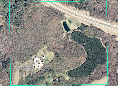
Figure 1: This is an aerial image of the Priory in Eau Claire, Wisconsin. The outline defines our navigation boundary. As can be seen, most of the area is covered in trees.
Summaries of Past Activities:

In order to better understand and compare the activities over the past few weeks, it is important to summarize the goals and methods of each week’s activity.

Week 1: Creating a navigation map:

For Week 1, we were divided into our groups of three and created the maps we would be using to navigate the Priory in Week 2 using distance and azimuth techniques. The goal was to create a clear, concise map that would be informative and easy to use in the field. Each person created two maps—one that focused around an aerial photo of the area and another that focused on the elevation (Figures 2 and 3). By the end of the week, we had to choose two maps that we thought would best suit us for our navigation (Figures 3 and 6).

The aerial maps included five meter contour lines, an aerial image, a grid system, and a study area outline while the elevation map had two-foot contour lines, a DEM, and underlying aerial image, and a study area outline. We selected a UTM coordinate system to work in because it is true to distances and suited our rather small study area well. Unfortunately, my group and I chose two maps that were unsuitable for navigation because they either did not include a grid system or were in the incorrect coordinate system. This was later corrected, but not before we had to complete the navigation (Figures 4 and 5).
Figure 2: This is the aerial map I created during Week 1 for the distance azimuth navigation. It was not chosen for one of our final maps.


 Figure 3: This is the elevation map I made during Week 1 to use for the distance-azimuth navigation. It was chosen to be one of our final maps that we would use in the field.
Figure 4: This is a portion of the elevation map I created for our distance-azimuth navigation (Figure 3). This is showing the labels for the grid system of the map which is in the incorrect coordinate system--Transverse Mercator.
Figure 5: This is a portion of the elevation map I created for our distance-azimuth navigation after it had been corrected. This is now in the UTM coordinate system and can be compared with Figure 4.

 Figure 6: This is the aerial map my group and I chose for the distance-azimuth field navigation. It was created by Kory Dercks.
 
We also set a pace count during this first week that we would later use in our distance-azimuth navigation. The pace count is set for a 100 meter distance and is used to calculate distance in the field when no other tools are available. My pace count was about 65 strides for 100 meters.

Week 2: Distance-Azimuth Navigation:

The objective of Week 2 was to navigate the Priory using only a map and compass. We worked in our groups of three and were expected to navigate to six different points in the Priory set out by our professor. Before we could head out into the field, we had to plot our points on our map by matching the coordinates given to us with the X, Y coordinates on our map. Because neither of the maps we selected from Week 1 had the correct grid system, we had to use an extra map from another group (Figure 7).
 
Figure 7: This is the map we used to navigate the Priory after we found out that both of the maps we selected were unsuitable. It was created by another student in the class.
 
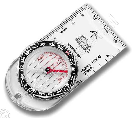
Next, we learned how to use a compass to find the azimuth from one point on our map to the next (Figure 8). The steps to finding the azimuth go as follows:

  1. Draw lines from one point to the next on our map. This makes it easier when it comes time to measure the angle and distance.
  2. Line up North on the compass with the top of our map. The grid lines we had on the map were not perfectly straight and couldn’t be used as a reference.
  3. Line up the black arrow on the compass with the line drawn from point to point (Step 1).
  4. Find the correlating angle. If the black arrow is lined up correctly with the line from point to point, and the North on the compass is pointing towards the top of the map, there should be an angle number indicated by a small white line on the compass that is the azimuth from one point to the next.

Figure 8: This is an image of the compass we used to find the azimuth between points for the distance-azimuth navigation exercise.


With this accomplished, we were ready to head out into the field. We had one group member using the compass to find the azimuth between points and direct the other members in the right direction by pointing out landmarks that fell along the correct azimuth.  Another member was a “scout” ahead and would walk in the direction indicated by the first team member. Finally, the third group member used their pace count and walked in a direct line to the scout to keep track of distance. We found that we navigated fairly directly from one point to the next and thought that the technique was very useful. The only major downside to this sort of navigation is the preparatory work needed—making a map, learning how to use the compass, and making sure that we were using the equipment correctly. We also found that it was difficult to keep an accurate pace count while navigating in a hilly, wooded area with a lot of snow cover.

Week 3: GPS Navigation:

For our second navigation activity, we used only a GPS unit and the coordinates of six different points to navigate to in the Priory. We worked within the same groups as before, but were given points in a different course from the previous week. The GPS units we were using were the Etrex Legend H by Garmin that provided our current coordinate position and a built in compass. It also allowed us to track our route using a tracklog function.  We found that the easiest way to navigate between points was to match the given Y coordinate and the Y coordinate on the GPS and then find the X coordinate.

Figure 9: These were the coordinates of the points we had to find for the GPS navigation exercise. We had to match these numbers to those on our GPS units to find the points.
 
Figure 10: This is a photo of the GPS unit we were using for our navigation. It is an Etrex Legend H by Garmin.
 
 
The purpose of this navigation exercise was to compare the distance-azimuth technique with a GPS technique and assess the benefits and downsides to each. This technique was much more difficult for my group and me because we were completely blind in the field. We had no sort of landmark to indicate whether or not we were close to a point other than the coordinates on the GPS unit as we had with the maps. As can be seen on our tracklog, we were zigzagging across the area and were most definitely not navigating directly from point to point. The most valuable aspect of using the GPS unit was being able to access our tracklog and see exactly where we were on the map. Unfortunately, this is only useful for post-analysis and did not help us in the field.

After the navigation was completed, we downloaded our tracklogs and saved them as shapefiles to be used to create a map in ArcMap. We were able to compare our tracklogs to one another and see how closely they matched within each group.


Figure 11: This is a map of my individual tracklog from the GPS navigation. My tracklog is marked by the red dots, and the navigation points are marked by the green dots. As can be seen, I did not travel directly between points.
 
Figure 12: This map highlights the area in which my group and I looped around our own tracks trying to find a point.
 
Figure 13: This is a map of the tracklogs collected by the three members of my group. They follow almost exactly the same path but are not perfectly the same. The data was also collected at different time intervals which can be seen by the differences in frequency of the points for each person.
 
Figure 14: This is a map of all of the tracklogs for the entire class. I sorted the groups by which course they followed, so that each course has six tracklogs in a similar color scheme to better view the data.
Methods:

Fortunately, for this week, we were able to combine both the GPS and the maps to navigate to our points in the Priory. Before we went out into the field, however, we had to revise our maps from week one. The only change (aside from changing the coordinate system) was adding a Points feature class, which was given to us by our professor, and adding the No-shooting zones feature class (Figures 15 and 16).

Figure 15: This is the revised elevation map we used for our final navigation. It includes the navigation points and the no-shooting zones.


Figure 16: This is the revised aerial map we used for our final navigation. It was created by Kory Dercks.

Once we arrived at the Priory, we had to set up our paintball equipment and collect our maps (Figure 17). The equipment included a paintball gun, mask, and snow shoes (optional). I have never used a paintball gun before and had to be instructed how to use it as well. Apparently, I was pointing the barrel of my gun at people’s faces unintentionally with the safety lock off. We also had to enable our tracklogs as we had for the previous week to give us our routes for later analysis. Then, we were able to set off to find our points. Every group started from the same point this week, and we had five minutes before we could start shooting other teams. My group and I seemed to have travelled far from any other groups and had few interactions with other teams. We had several gun fights and won all of them except for one. It is possible that I hit someone in one of the fights too (This is a contentious issue, but I would like to think it was me).

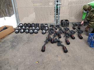
Figure 17: This is a photograph of the paintball equipment my class and I used for our final navigation. Photo credit: Tonya Olson
 
As far as the navigation was concerned, we found that we mostly used our map to conduct the navigation and rarely used our GPS except to mark waypoints that we would map later, though it was convenient as a secondary resource. The compass on the GPS would have been useful as well, but it was extremely inaccurate as we learned with the GPS navigation in the previous week. We found the contour lines and the aerial imagery most valuable while looking at the maps because we could associate them with landmarks in the field. My group and I successfully navigated to 14 of the 15 points and were the second group to complete the activity, but we were unable to locate one of the points (Figure 18).

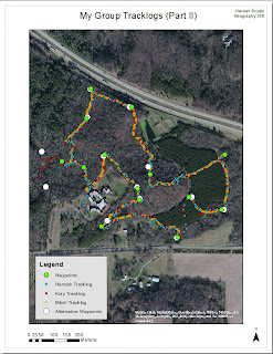
Figure 18: This is a map that compares the waypoints collected by my group and the waypoints collected by another group. As can be seen, we did not find one of the points on the left-hand side of the map (One of our waypoints is missing, but we did navigate to 14 of the 15 points though it doesn't appear as though we did).
 
After the navigation was completed, we had to download our tracklog and waypoints to a computer. This was done using the DNR GPS software. This software was relatively intuitive—we simply needed to click on the track tab and hit “download” for our tracklog and click on the “Waypoint” tab and hit “download” here as well. Then we had to save the data as point shapefiles in the UTM coordinate system. Once the download was complete and the data was saved as shapefiles, we were able to create maps of the tracklogs using ArcMap. I created a map for my individual tracklog (Figure 19), my group’s tracklog, and the class tracklog.

Figure 19: This is a map of my individual tracklog and waypoints for the final navigation. There were  a couple instances where I did not get a waypoint for one of the navigation points, so the waypoint data is incomplete.
 
Figure 20: This is a map of the tracklogs for my group. As can be seen, we have almost exactly the same routes. At one point, Kory (red) tried to find a point on his own which accounts for the lone red route on the left-hand side of the map.
Figure 21: This is a map of all the tracklog data collected by the class. I organized the tracklog colors for each group so as to better view the data and the routes taken by each group. The waypoints are represented by the large white points on the map.
Results:

This week’s activity went relatively smoothly in terms of navigation. My group and I found it much easier and more efficient to navigate using a map along with the GPS unit as compared to only using the GPS unit. We were able to orient ourselves by comparing features in the field—ridges, depressions, and so on— to those on our map. With the GPS unit, we had no reference to go by and ended up looping over our own tracks at one point. The map was also beneficial because it allowed us to plan out a route to navigate quickly to every point. By comparing the tracklogs from the GPS navigation to those of this week, we can see that we traveled much more directly between points with the map (Figures 22 and 23).

Although we can’t see the tracklog data for the first navigation activity using the distance-azimuth technique, I found that this week’s navigation with a map and GPS was easier than that strategy as well. Using both the GPS and a map required less preparation and we didn’t have to worry about keeping a pace count while we were in the field either. Overall we found that a combination of both the GPS and the maps was the best way to navigate the field. I would argue that a compass would make the navigation go even more smoothly, because the compass on the GPS was completely unreliable and finding our compass direction was slightly difficult.

The major challenge of this navigation activity was keeping track of the points we had already navigated to and trying to complete the task quickly. Planning out the route took a bit of time, but we ended up having to revise our route after we ran into another team—this is where we became slightly confused about which points we had already visited and which we still had to navigate to. We also had an issue after the team we paired up with had lost their map in the snow and had to share one navigation map among six people. Some of my team members did not have sufficient battery life in their GPS units, either, and their units died before they could finish the course. Luckily for me, my GPS units survived for the entire class period. As with the other navigation activities, we had to face the added challenge of deep snow cover on the ground as well (Figure 24). There were times where we would unknowingly step into a snow drift up to our hips. The paintball gun was also rather heavy to be carrying around for three hours and added a little more difficulty to the navigation, too.

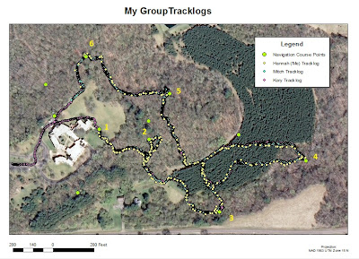
Figure 22: This is the same map for the group tracklong data of the GPS navigation as seen in Figure 13, but I wanted it to be compared to the group tracklog data collected for the final navigation. By comparing the two maps and tracklogs, it is clear that the final navigation was much more efficient than the GPS navigation because we were able to use a map.
 
Figure 23: Again, this is a repeated map, but it is useful to look over it again in comparison with Figure 22. It is clear that we navigated much more directly between points than we had using only the GPS unit.
Figure 24: This is a photo of my grou member, Kory Dercks, from the GPS navigation exercise. It is meant to show the snowy conditions in which we were navigating the field for all three weeks we were at the Priory.
 
Conclusion:

In conclusion, navigating in the field can be accomplished using several different techniques. One is to use distance and azimuth to navigate between points and requires a map, compass, and pace count. This is a relatively efficient form of navigation but requires a lot of pre-navigation work. We had to make a map, learn how to use the compass, and find our pace count. Another is to use only a GPS unit and try to match the coordinates of a given point to those on the GPS. This technique seems very simple, but we found it to be the most difficult form of navigation. Without any reference to our surroundings, we ended up zigzagging between points rather than travelling directly. Lastly, a combination of these techniques can be utilized. My group and I found that the combination of a map and GPS was the most efficient form of navigation. The map was extremely useful because it allowed us to compare physical features in the field to those on the map, and the GPS was helpful as well because it allowed us to keep a tracklog of our navigation that we could use for later analysis.